When someone lands on a therapy website, they form an impression within seconds -- long before they read a single word. The colours on the screen, the shape of the letters, the amount of white space -- all of it communicates something. For therapy websites, what it communicates matters more than in almost any other industry, because your visitors are often arriving during some of the most vulnerable moments of their lives.
Why Colour Matters
Think of your colour palette as the lighting, walls, and furniture of your online practice. Just as a therapist carefully considers the environment of their physical office -- the warm lamp instead of fluorescent overhead lights, the soft textures, the calming artwork -- your website's colour scheme creates an emotional environment that visitors experience before they consciously process it.
Colour psychology isn't about manipulation. It's about alignment. Your website should feel like an extension of the safe, welcoming space you've created in your practice. When the visual tone matches the therapeutic experience, visitors feel congruent trust. When it doesn't -- when a trauma therapist's website uses aggressive reds and stark contrasts -- there's an unconscious disconnect that drives people away.
Research consistently shows that people make subconscious judgments about a website within 50 milliseconds, and colour accounts for up to 90 percent of that snap assessment. For therapy websites, where trust is the currency that converts visitors into clients, getting the palette right isn't a design luxury. It's a clinical necessity.
Recommended Colours
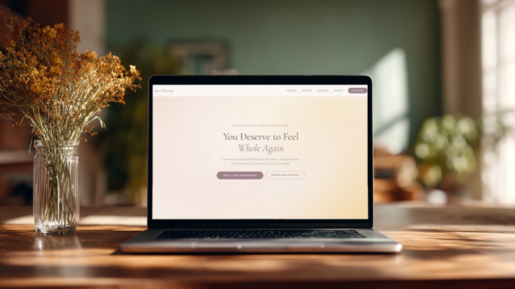
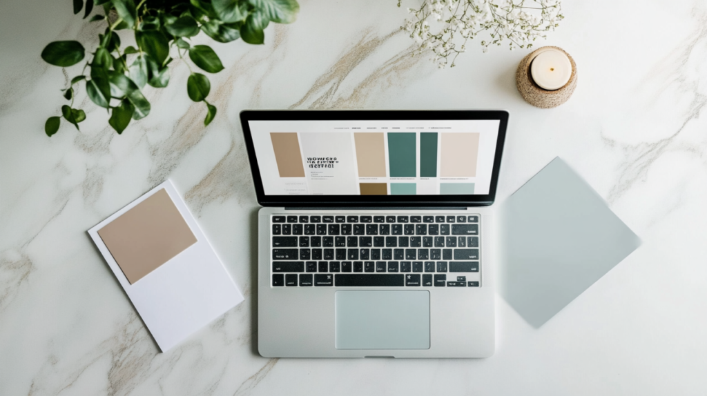
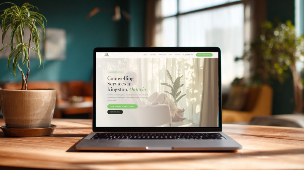
Deep teals and forest greens communicate stability, growth, and groundedness. These colours are rooted in nature and carry associations with renewal and balance. They work exceptionally well for practices focused on personal growth, mindfulness, or nature-based therapies. A deep teal as a primary colour paired with lighter sage accents creates a palette that feels both professional and nurturing.
Warm neutrals -- soft creams, warm greys, muted taupes -- create a sense of safety and openness. These colours recede visually, giving the content room to breathe and reducing the cognitive load on an already-overwhelmed visitor. Use them as background and secondary tones to create spaciousness in your design.
Earthy tones like terracotta, clay, and warm browns work beautifully as accent colours. They add warmth and humanity without overstimulating. These are particularly effective for practices focused on somatic work, holistic health, or trauma recovery, where grounding is a core therapeutic concept.
Soft corals and dusty roses convey approachability and compassion. They're warm without being aggressive, feminine without being exclusionary. These tones work well for practices focused on relationship therapy, maternal mental health, or self-compassion work.
Colours to Avoid
Bright reds activate the sympathetic nervous system. They signal urgency, danger, and alarm -- exactly the emotional states your visitors are trying to escape. Even as accent colours, saturated reds on a therapy website create an undercurrent of anxiety that undermines the sense of safety you're trying to build.
Pure black backgrounds feel heavy and oppressive. While dark themes work for tech companies and entertainment brands, they create a claustrophobic feeling on therapy websites. Dark backgrounds also reduce readability for longer text, which is a problem when your copy needs to do the emotional heavy lifting.
Stark white in large, unbroken expanses feels clinical and cold -- more hospital than healing space. Some white space is essential for readability, but warm it up slightly with cream or off-white tones to avoid the sterile feeling.
Oversaturated colours of any hue create visual tension. Neon greens, electric blues, and vivid purples might grab attention, but they also create a sense of agitation. Your palette should feel like a deep breath, not a jolt of caffeine. Muted, desaturated versions of almost any colour will serve a therapy website better than their fully saturated counterparts.
Font Strategy
Typography on therapy websites works best as a two-font system: a serif typeface for headings and a sans-serif for body text. This pairing creates a visual rhythm that guides readers through the page while communicating two complementary qualities -- warmth and clarity.
Serif headings build trust and authority. Serifs -- the small strokes at the ends of letterforms -- carry associations with tradition, reliability, and depth. They feel literary and human, which is exactly the tone you want when someone is deciding whether to trust you with their mental health. Typefaces like Playfair Display, Lora, or Newsreader work beautifully in this role.
Sans-serif body text prioritizes readability. When visitors are reading paragraphs about your approach, your modalities, or what to expect in a session, clarity is paramount. Sans-serif fonts like Montserrat, Inter, or Hanken Grotesk render cleanly at body text sizes and on screens of all resolutions.
A pairing like Playfair Display for headings and Montserrat for body text creates a sophisticated, trustworthy feel. The contrast between the elegant serif and the clean sans-serif gives the page visual interest while maintaining a cohesive tone. Avoid using more than two typefaces -- three or more fonts create visual noise that undermines the calm you're trying to create.
Conversion Impact
Calming palettes reduce bounce rates. When visitors feel at ease on your site, they stay longer. They read more of your copy. They explore your services pages. Every additional second they spend on your site increases the likelihood they'll take the next step. Data across therapy websites consistently shows that sites with intentional, calming colour palettes outperform visually chaotic ones on time-on-page and pages-per-session metrics.
High-contrast calls-to-action are the one place where visual boldness serves you. Your call-to-action button should stand out clearly against its surroundings. This doesn't mean it needs to be red or orange -- a deep teal button on a warm cream background creates strong contrast while staying within a calming palette. The key is that the CTA is unmistakable without being jarring.
Minimum 16-18px for body text is non-negotiable. Many therapy websites use body text that's too small, forcing visitors to strain or zoom. This is especially important given that a significant portion of therapy website visitors are on mobile devices, often reading in bed or in stolen moments of privacy. Generous text size communicates care and accessibility.
Core Philosophy
The most important thing to understand about colour and typography on therapy websites is that design functions therapeutically. Your website's visual environment communicates safety before a single word is read. This is a core principle of effective therapist web design. It either invites people in or pushes them away, and that decision happens at a level below conscious thought.
Every design choice -- the softness of the palette, the weight of the typography, the rhythm of the spacing -- is telling your visitor something about what it would feel like to work with you. When those choices are made with the same intentionality you bring to your therapeutic space, your website becomes more than a marketing tool. It becomes the first moment of the therapeutic relationship.
Your website doesn't need to be trendy. It needs to feel safe. When it does, the conversions follow.

Jordan helps therapists and wellness practitioners get found and get booked. Since 2012, he's specialized in SEO, Google Ads, and conversion-focused websites for practices across North America.