Your therapy website is often the very first interaction a potential client has with your practice. Before they ever pick up the phone or fill out a contact form, they are forming an impression of who you are and whether they feel safe enough to reach out. A thoughtfully designed website can make all the difference between someone booking an appointment and someone clicking away to the next search result.
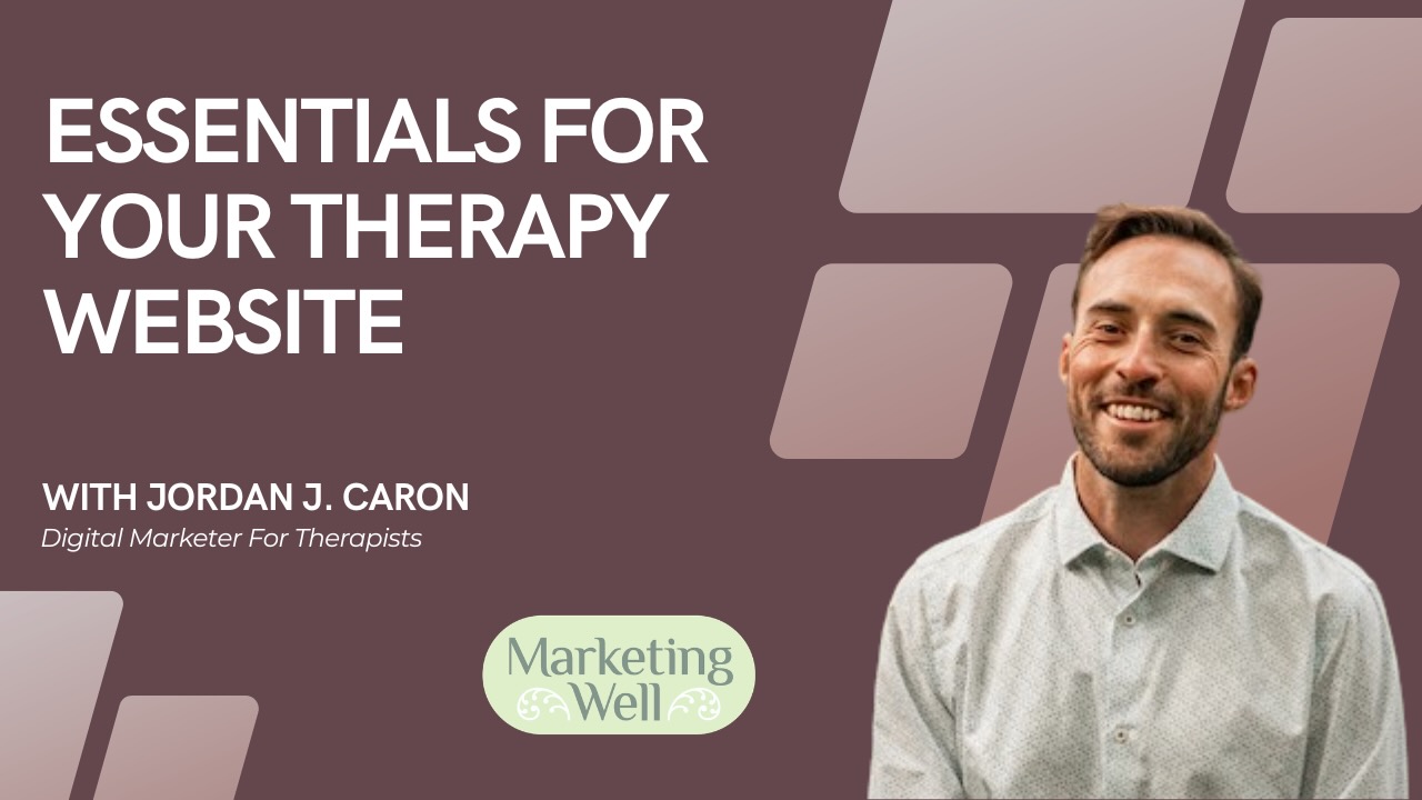
There are nine key components that every effective therapy website needs. Whether you are building a new site from scratch or evaluating the one you already have, these essentials will help you create an online presence that connects with the people you want to serve.
1 -- Comprehend Your Target Audience
Before you write a single word of copy or choose a colour palette, you need to understand who your ideal client is. What are their concerns? What language do they use to describe their struggles? What would make them feel comfortable reaching out to a therapist for the first time?
Take time to define the specific populations and issues you serve. If you specialize in anxiety in young professionals, your messaging and design choices will look very different from a therapist who works with couples facing infidelity. The more clearly you can picture the person sitting on the other side of the screen, the more effectively your website will speak to them.
Address their concerns head-on. Many potential clients are nervous, skeptical, or unsure about therapy. Your website should acknowledge those feelings and gently guide visitors toward taking the next step.
2 -- Client Demographics Shape Design
The demographics of your ideal clients should directly influence your design decisions. A therapist who primarily works with young adults in their twenties may want a modern, clean aesthetic with bold typography and a conversational tone. A practice serving older adults might prioritize larger text, simpler navigation, and a more traditional layout.
Mobile optimization is non-negotiable regardless of your audience. Over 60% of web searches now happen on mobile devices, and that number continues to climb. If your website is not easy to navigate on a phone, you are losing potential clients before they even read your first paragraph.
Consider the emotional state of your visitors. Someone searching for a therapist is often in a vulnerable place. Your design should feel calm, welcoming, and easy to navigate -- not overwhelming or cluttered.
3 -- Significance of Lucid Menu Structure

Simplicity is the hallmark of effective website navigation. When someone arrives on your site, they should be able to find what they need within seconds. A confusing menu structure creates friction, and friction causes people to leave.
Stick to the essentials: About, Services, Contact, and Blog. These four pages form the backbone of any therapy website. Your About page builds trust. Your Services pages explain what you offer. Your Contact page makes it easy to reach out. And your Blog demonstrates expertise while improving your SEO.
Avoid burying important information in dropdown menus or subpages. If a visitor has to click more than twice to find your phone number or booking link, your navigation needs work. Every page should have a clear path to your call to action.
4 -- Mobile-Friendliness
More than 60% of searches for therapists and mental health services happen on mobile devices. If your website does not look and function well on a phone, you are effectively invisible to the majority of your potential clients.
Responsive design means your website automatically adjusts its layout, images, and text to fit the screen it is being viewed on. Buttons should be large enough to tap. Text should be readable without zooming. Forms should be easy to fill out with a thumb.
Test your website regularly on different devices and screen sizes. Tools like Browserling allow you to preview how your site looks across various browsers and screen dimensions. What looks perfect on your desktop may be completely broken on a phone, and you will never know unless you check.
5 -- Selecting Colours and Fonts

Colour psychology plays a significant role in how visitors perceive your practice. Calming blues and greens convey trust and tranquility. Warm earth tones feel grounding and approachable. Bright reds and oranges can feel energizing but may also trigger anxiety in someone who is already feeling overwhelmed.
Choose a colour palette that reflects the emotional tone of your practice. If you specialize in trauma therapy, softer and more muted tones may feel more appropriate. If your focus is on personal growth and empowerment, slightly bolder choices can work well.
Fonts matter too. Clean, professional typefaces communicate credibility. Avoid overly decorative or script fonts that can be difficult to read, especially on smaller screens. Consistency across your site -- using the same two or three fonts throughout -- creates a polished, cohesive look.
6 -- Consistent Branding
Your website is one piece of a larger brand ecosystem. The colours, fonts, tone of voice, and imagery on your website should align with everything else your practice puts out into the world -- your business cards, social media profiles, email signatures, and office decor.
Consistent branding builds recognition and trust. When a potential client sees your Instagram post, clicks through to your website, and then receives a welcome email, the experience should feel seamless. Disjointed branding creates confusion and can undermine the sense of professionalism you are working to establish.
Create a simple brand guide for your practice that documents your primary colours, fonts, logo usage, and preferred tone. This does not need to be elaborate -- even a one-page reference document will help you maintain consistency as your online presence grows.
7 -- Comforting Online Haven
Your website should feel like a safe space. Many of the people visiting your site are dealing with difficult emotions and may be reaching out for help for the first time. The design, language, and overall experience of your website should communicate warmth, safety, and confidentiality.
Use language that is compassionate and non-judgmental. Avoid clinical jargon that might feel intimidating. Instead of saying "I treat patients with generalized anxiety disorder," try "I help people who feel constantly worried or on edge find relief and reclaim their peace of mind."
Include elements that reinforce confidentiality and trust -- a clear privacy policy, mentions of your professional credentials, and a welcoming tone throughout. The goal is for someone to land on your site and think, "This person understands what I am going through."
8 -- Articulating Services
One of the most common mistakes therapists make on their websites is lumping all of their services onto a single page. If you offer individual therapy, couples counselling, EMDR, and group workshops, each one deserves its own dedicated page.
Dedicated service pages serve two important purposes. First, they allow you to speak directly to the specific concerns of each client segment. Someone looking for couples therapy has very different questions than someone exploring EMDR for trauma. Second, separate service pages -- essentially dedicated landing pages -- significantly improve your SEO by allowing you to target specific search terms for each offering.
On each service page, explain what the service involves, who it is for, what the client can expect, and how to get started. Be specific and human. Potential clients want to know what it will actually feel like to work with you, not just read a textbook definition of your modality.
9 -- Call to Action

Every page on your website should have a clear, compassionate call to action. You have done the work of attracting someone to your site and building enough trust for them to keep reading -- now you need to guide them toward the next step.
Effective calls to action for therapy websites use empathetic language and action words. Instead of a generic "Submit" button, try "Book Your Free Consultation" or "Take the First Step Today." The language should feel inviting, not pushy.
Placement matters as much as wording. Include a call to action at the top of each page, within the body content where it feels natural, and at the bottom. A visitor should never have to scroll or search to figure out how to contact you. Make the path from reading to reaching out as seamless as possible.
Why Websites Are Indispensable
In today's digital-first world, a website is not optional for a therapy practice -- it is essential. Your website establishes your online presence and ensures that people can find you when they search for help. It provides a central hub of information where potential clients can learn about your approach, your qualifications, and what it is like to work with you.
A well-built website builds credibility. It signals to potential clients that you are a legitimate, professional practice. It also provides convenience -- allowing people to learn about you, read about your services, and reach out on their own terms, at their own pace.
Beyond serving your clients, your website is a powerful marketing tool. It supports your SEO efforts, gives you a platform for content marketing through blogging, and serves as the hub for all of your other digital marketing activities. Every Google Ad, social media post, and directory listing should ultimately point back to your website.
Investing in a thoughtful, well-designed therapy website is one of the highest-impact things you can do for your practice. These nine essentials will help you create a site that not only looks professional but actually works -- attracting the right clients and guiding them toward getting the help they need.

Jordan helps therapists and wellness practitioners get found and get booked. Since 2012, he's specialized in SEO, Google Ads, and conversion-focused websites for practices across North America.