Every website project starts with a gap between where a practice is and where it wants to be. For Cataraqui Counselling Clinic in Kingston, Ontario, that gap was clear: a team of skilled, compassionate therapists whose existing website didn't come close to reflecting the quality of care they provide. This is the story of how we closed that gap.
The Brief
Cataraqui Counselling is an established practice in Kingston with a strong reputation in the community. Their clinicians are experienced, their approach is thoughtful, and their clients trust them deeply. But their website told a different story. It was dated, difficult to navigate, and generic in a way that made them look interchangeable with every other therapy practice in the region.
The brief was straightforward: build a digital presence through professional web design for therapists that matches the calibre of care. The new site needed to feel warm and professional, communicate the breadth of services clearly, and -- critically -- convert visitors into consultation bookings. Kingston is a mid-sized market, and the practice needed a website that could compete with larger centres while reflecting the local, personal nature of their work.
Beyond aesthetics, there was a strategic dimension. The practice was preparing to invest in digital marketing, and any advertising spend would be wasted without a website capable of converting the traffic it received. The redesign wasn't just about looking better. It was about building the foundation for sustainable growth.
User-Centered Design
The design process started with a fundamental question: who is visiting this site, and what state are they in when they arrive? The answer shaped every decision that followed.
People visiting a therapy website are rarely browsing casually. They're arriving during vulnerable moments -- after a difficult conversation with a partner, during a sleepless night of anxiety, or at the quiet urging of someone who cares about them. They're uncertain, often skeptical, and looking for a reason to trust.
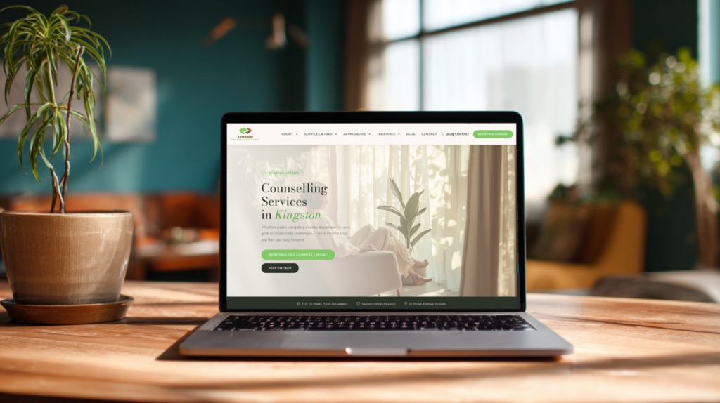
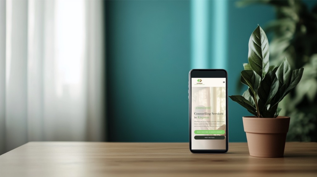
With that in mind, we designed the hero section to emphasize local context immediately. Visitors needed to know, within seconds, that this was a Kingston practice staffed by real people who understood their community. Generic stock photography and vague promises wouldn't cut it. The hero communicated specificity: who these therapists are, where they practice, and what becomes possible when you reach out.
We built the entire user flow around a single call-to-action: book a free consultation. Every page, every section, every piece of copy was designed to move visitors toward that one action. Multiple CTAs competed for attention on the old site -- email here, call there, fill out this form, visit that page. The new design eliminated that friction. One clear path forward, repeated at natural decision points throughout each page.
Visual Identity
The visual identity was built to communicate calm professionalism with warmth. We chose a soft green and warm cream palette as the foundation -- colours rooted in nature that evoke growth, stability, and safety. Forest green accents added depth and sophistication without overwhelming the lighter tones.
Typography followed a deliberate pairing strategy: editorial serif headers paired with a clean sans-serif body font. The serifs communicate tradition and trustworthiness in the headings, while the sans-serif body text ensures comfortable readability through longer passages about therapeutic approaches and service descriptions. This contrast creates a visual rhythm that guides readers naturally through each page.
Photography was a priority from the start. We advocated strongly for honest photography over stock images. The practice invested in a professional photo session that captured their actual space, their real team, and the genuine warmth of their environment. Stock photography would have undermined every other design decision we made. When a visitor sees the actual therapist they might work with, sitting in the actual room where sessions happen, trust isn't something you have to argue for. It's communicated instantly.
The overall visual tone aimed for what I think of as "elevated approachable" -- sophisticated enough to convey competence, warm enough to feel welcoming. The site needed to feel like walking into a well-designed therapy office: calm, considered, and immediately comfortable.
Technical Architecture
The site serves a dual purpose that can sometimes feel contradictory: emotional resonance and SEO optimization. Visitors need to feel something. Search engines need to understand something. The technical architecture was designed to accomplish both without compromising either.
We built Kingston-specific service pages targeting the search terms that matter most to the practice. Rather than a single generic "Services" page, we created dedicated landing pages for key modalities -- pages focused on terms like "trauma therapy Kingston" and "couples counselling Kingston." Each page was written to serve two audiences: the person searching for help and the search engine trying to understand what the page offers.
The content structure follows consistent page rhythms across the site. Every service page opens with empathetic, problem-aware copy, transitions into the therapeutic approach, introduces the relevant clinicians, and closes with a clear call-to-action. This consistency isn't just good UX -- it trains visitors to know what to expect as they navigate the site, reducing cognitive load and keeping them focused on the decision to book.
Internal linking was architected intentionally from day one. Service pages link to relevant therapist profiles. Therapist profiles link back to the modalities they specialize in. The blog connects to services through contextual, natural links. This web of internal connections helps search engines understand the site's topical authority while guiding visitors deeper into the content that matters most to them.
Platform Choice
We built the site on WordPress, which was the right choice for this practice for several reasons. The Cataraqui team needed content management independence -- the ability to update therapist bios, add new team members, publish blog posts, and adjust service descriptions without calling a developer every time. WordPress gives them that autonomy through a familiar, intuitive editor.
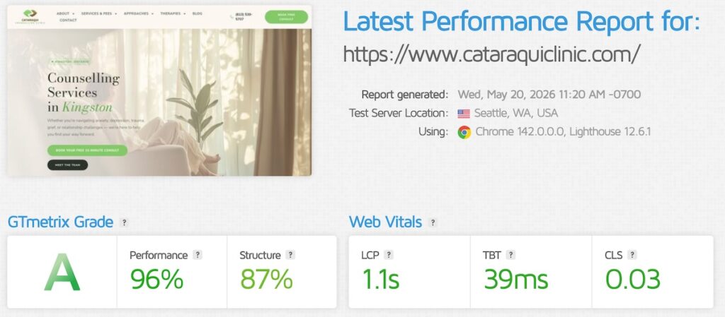
Speed and mobile optimization were non-negotiable technical requirements. We used a lightweight theme framework, optimized images aggressively, implemented caching, and minimized third-party scripts. The result is a site that loads quickly on mobile devices -- important given that a majority of therapy website visits come from phones, often during those private moments when someone is finally ready to seek help.
WordPress also provides the flexibility to grow. As the practice expands its digital marketing efforts, the site can accommodate new landing pages for advertising campaigns, additional service pages as clinicians join, and the analytics integrations needed to measure what's working. The platform scales with the practice rather than constraining it.
Results
The redesigned Cataraqui Counselling website now reflects the quality of care the practice delivers. The gap between their clinical excellence and their digital presence has been closed. Visitors land on a site that feels intentional, trustworthy, and warm -- the same qualities that define the therapeutic experience itself.
More importantly, the site provides a foundation for future marketing. With proper SEO architecture in place, Kingston-specific service pages live and indexed, and a conversion-focused design guiding visitors toward booking, the practice is positioned to invest in Google Ads and SEO with confidence that the traffic will convert.
Every therapy practice deserves a website that works as hard as the clinicians behind it. For Cataraqui Counselling, the new site isn't just a digital brochure. It's the front door to a practice that changes lives -- and now it looks and feels like it.
Jordan helps therapists and wellness practitioners get found and get booked. Since 2012, he's specialized in SEO, Google Ads, and conversion-focused websites for practices across North America.